Clear first click
The website immediately shows where to play and what the project is about.
LumaDrop Play is designed to feel like a real creative product page: polished UI, gentle motion, human storytelling, and one satisfying game users can instantly understand. It is friendly, lightweight, and easy to explore.

The website immediately shows where to play and what the project is about.
Spacing, glass panels, contrast, and typography now feel more balanced and premium.
The page feels like a creative studio showcase instead of a quick one-page template.
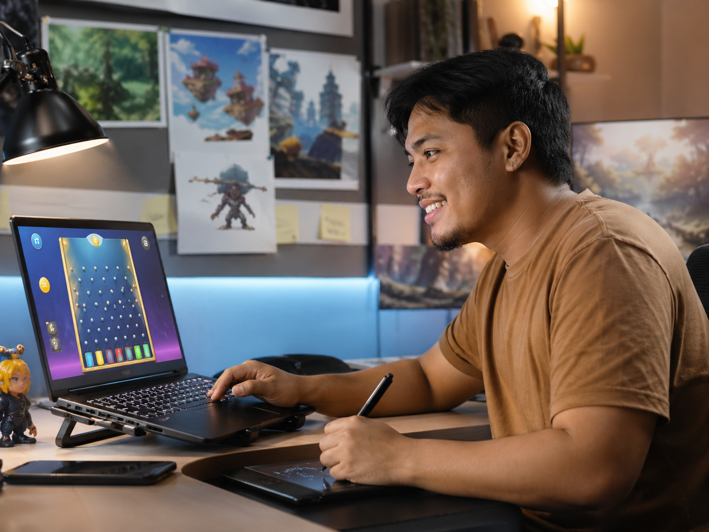
This is the center of the whole website. The board is larger, cleaner, and supported by better feedback so the experience feels smooth and immediately understandable.
Welcome. This final version is built like a polished free-play product with one beautiful featured game.
Better layout decisions, stronger imagery, and lighter interactions make the project easier to trust and nicer to browse.
The workspace visual gives the website a clear creative identity and supports the portfolio presentation.

Local-life inspired imagery adds color, texture, and a more human emotional layer to the brand.

The product now clearly communicates easy, everyday play — light, social, and friction-free.
This section helps the site feel like a real project showcase. It explains the thinking behind the improved user experience.
The core game already worked. The job of this final version was to improve perception, clarity, and emotional quality without making the experience heavy or complicated.
Soft gradients, subtle glass panels, and real-world imagery give the site a more human and memorable visual personality.
The result feels closer to a release-ready indie game landing page: cleaner, more confident, and more pleasant to interact with.
The final site keeps the feeling of an active creative project. That makes it feel more interesting and less generic.
Buttons, reveals, hover states, and subtle motion all help the product feel more refined and cohesive.
The featured Plinko area now has better focus, spacing, and reward feedback, making the interaction more satisfying.
Extra sections make the project feel more deliberate and better prepared for demos, sharing, or live testing.
This release is focused on polish: improved UI, clearer UX, better motion, and a friendlier brand feel built around one strong hero game.